_1779606969667-ZJZA6fNi.png)
_1777949319555-DTVd6WJp.png)
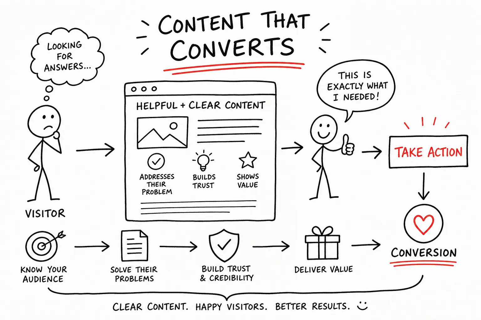
If your website isn't generating enquiries, your conversion-focused website content may be the reason — and it's probably not what you think. When a site goes quiet, many small business owners start questioning the colour scheme, the layout, or the logo. Some assume they simply need more traffic. Rarely do they sit down and read what the page actually says to someone who knows nothing about their business.
The truth is quieter than most marketing advice will tell you: content often drives more persuasion than superficial design tweaks. Conversion-focused website content isn't about being clever or pushy. It's about clarity — making it easier for the right people to say yes. At Fairweb, this thinking shapes every website we design from the first planning conversation, not as an afterthought once the design is done. This article covers the four elements that matter most: headlines, page structure, trust signals, and calls to action.
What conversion-focused website content actually means
A conversion is a specific action. Someone fills in your contact form, calls your number, or clicks a button to book a call. The content on the page is what drives that decision, not the font choice or the hero image. This is worth sitting with, because most small business websites are built to inform rather than to move.
The clearest sign of a website that isn't converting is one that talks about the business rather than the visitor. "We've been in business since 2003" and "Quality service you can trust" appear on thousands of NZ small business websites. They communicate almost nothing specific, and they do nothing to help the visitor understand what happens if they contact you.
Conversion-driven copy isn't manipulation. It's reducing the friction between a visitor who already wants what you offer and the action that connects them to you. The goal is to make the right decision obvious, not to pressure people into something they don't want. When the content is working properly, the visitor feels like the page read their mind.
This approach works best when it shapes the structure of a site from the beginning. Building persuasive page logic into a wireframe before a single line of code is written tends to produce better outcomes than trying to rewrite a site that was built around the wrong questions.
Headlines: the first seconds your website has to make an impression
A headline is the highest-leverage piece of conversion copywriting on any page. If it doesn't reflect what the visitor came looking for, or fails to pull them in, nothing below it matters. Research across large-scale opt-in headline tests found that straightforward, formula-driven headlines outperformed creative alternatives the vast majority of the time.
Three headline structures have proven themselves across consistent A/B testing:
- Benefit plus Timeframe — "Get a professional website built in two weeks" tends to perform well for cold traffic because it reduces perceived risk and sets clear expectations.
- Number plus Result — "Five ways to get more enquiries from your website" leans on specificity and social proof to draw readers in.
- Risk reversal — structured around "benefit or it costs you nothing", these work particularly well for warm traffic and high-consideration purchases, because they remove the perceived cost of saying yes.
Applying headline principles to NZ service businesses
For NZ service businesses, the principle is simple: lead with what the visitor gains, not what your business offers. A plumber's homepage doesn't need a clever tagline. It needs a headline that tells someone with a burst pipe exactly what happens next. "We fix burst pipes across Auckland, same day" is worth more than any creative line that sounds impressive but says nothing specific.
Common headline mistakes include leading with the business name, using industry jargon, or being vague about outcomes. "Welcome to Smith Electrical" and "Committed to excellence since 1998" communicate nothing a visitor can use. A clearer version would be: "Licensed electrician for Auckland homes, available seven days." That sentence answers the three questions every visitor is asking: what you do, where you do it, and whether you're available to help them.
Page structure for conversion-focused website content
Strong copy placed in the wrong order still underperforms. Top-converting pages follow a deliberate sequence: help the visitor understand the offer first, build trust second, then ask them to act. This mirrors how trust actually works in a real conversation.
The section of a page visible without scrolling needs to do the heaviest lifting. It should contain your headline, a subheadline that adds specificity, at least one form of social proof, and your primary call to action. If a visitor has to scroll just to understand what you do, you've already lost a portion of them. Research into CRO content strategy consistently recommends placing social proof above the fold, rather than leaving it for the bottom of the page.
Below the fold, the logical sequence runs like this: outcome-focused benefits, supporting trust signals, a mid-page call to action, detailed social proof such as testimonials or case studies, a FAQ section addressing common concerns, and a final call to action. This order exists because trust builds incrementally. You wouldn't ask a stranger to hire you thirty seconds into meeting them.
Pages that try to do too many things tend to underperform. High-converting pages focus on a single conversion goal. If your homepage simultaneously pushes newsletter signups, promotes three different services, and asks for a phone call, visitors default to doing nothing. Build each page around one specific action and organise everything else in service of it. If your site gets visitors but no enquiries, our guide on why websites get traffic but no enquiries digs deeper into this.
Trust signals: the content that does the quiet convincing
Trust signals aren't decorative. They answer the unspoken question every visitor carries: "Why should I believe any of this?" For NZ small businesses, where many customers make decisions based on local reputation and word of mouth, this content carries significant weight. Placing social proof near the bottom of the page, after all the persuasive copy, gets the order wrong. It belongs near the primary call to action, where hesitation lives.
Two or three well-placed client testimonials, star ratings, or recognisable logos near your enquiry button reduce friction at the moment of decision. Testimonials with names, photos, and specific results outperform generic praise by a wide margin. "Fairweb had our new website live in three weeks and we got two enquiries in the first month" does more work than "Great service, highly recommend."
Microcopy is the quiet category most businesses ignore entirely. These are the small pieces of text around forms, buttons, and input fields. A line like "We won't share your details" next to a contact form, or "Takes less than 60 seconds" above a booking button, addresses anxiety without requiring the visitor to go looking for reassurance. Low-cost to implement, these small adjustments can meaningfully reduce form abandonment.
Guarantees and risk reversal copy work along the same principle. Even service businesses without formal guarantees can write copy that reduces perceived risk through specificity and transparency. Stating clearly what happens after someone submits an enquiry — how quickly you respond and what the process looks like — is a form of trust signal that most websites simply don't include.
CTAs for conversion-focused website content that actually converts
A call to action is the moment a visitor decides whether to trust you with their time. Vague button copy such as "Submit," "Contact Us," or "Click Here" creates hesitation because it's unclear what actually happens next. CTA optimisation comes down to one principle: the more specifically a button describes the outcome for the visitor, the less friction sits between them and clicking it.
The evidence here is consistent. Switching from generic alternatives to "Start My Free Trial" doubled trial sign-ups in one documented test. Using first-person pronouns in CTA copy — "Get My Free Quote" instead of "Get Your Free Quote" — increased click-through rates by 90% in a well-cited Unbounce experiment. The wording of a button matters far more than most people expect.
Matching CTAs to visitor readiness
Not every visitor is ready to enquire on the first visit. A primary CTA for warm visitors can ask for a direct next step such as booking a call or requesting a quote. A secondary CTA for early-stage visitors might offer something with lower commitment, like a phone number to call or a downloadable guide. Having two options at different commitment levels on the same page serves visitors at different stages of readiness without confusing either group.
A single CTA buried at the bottom of a long page means visitors who don't scroll never encounter it. Repeating the call to action above the fold, mid-page, and at the bottom ensures that visitors with different levels of intent see it at the right moment for them.
Testing your content so you know what's actually working
You don't need expensive software or a dedicated analyst to start learning from your website. Simple, focused tests on your highest-impact elements — specifically headlines and CTAs — can generate meaningful insight over a few weeks of normal traffic.
Start with the headline on the page that receives the most visitors. A small percentage improvement there has the largest real-world impact. The basic mechanics of an A/B test are straightforward: one version versus one alternative, measured against a single metric such as enquiry form submissions or clicks on the primary CTA. Don't test five things at once. Test one.
Realistic expectations matter here. Headline rewrites typically produce uplifts of 10 to 25%. CTA copy changes tend to deliver 5 to 25% improvement in click-through rates. Around 60% of completed A/B tests deliver under 20% lift. The point isn't a single dramatic result; it's a compounding series of small improvements that add up over months.
For lower-traffic NZ small business websites, reaching statistical significance takes time. Patience is part of the process. Alongside any numbers, qualitative signals — including session recordings, customer feedback, and which pages generate the most form abandonment — give you something to act on while you wait for enough data to draw firm conclusions.
The reason many small business websites don't generate enquiries isn't the logo, the colour palette, or even the traffic volume. It's the content. Specifically, whether it earns trust, communicates a clear benefit, and makes the next step obvious to someone who arrived knowing nothing about the business.
The four pillars covered here — headlines that lead with outcomes, a page structure that builds trust before asking for action, trust signals placed where decisions happen, and CTAs that describe what actually happens next — work together as part of a broader CRO content strategy. Changing one without the others produces partial results. For more on how content and design pull together, see our article on website content versus design.
Before spending on ads or committing to a full redesign, read your homepage as if you'd never heard of your business. Ask whether it answers the question the visitor arrived with, whether it gives them a reason to trust you, and whether it makes the next step feel obvious and low-risk. That's where conversion-focused website content starts, and where most websites quietly fall short. If you'd like a second pair of eyes on yours, request a free website review or get in touch with Fairweb.
Frequently Asked Questions
What does 'conversion-focused website content' mean?
Conversion-focused website content is copy that makes it easy for the right visitors to take a specific action, like filling in a contact form, calling, or booking a call. It's not about being clever or pushy but about clarity: reducing friction so the right decision becomes obvious. Fairweb uses this thinking from the first planning conversation rather than as an afterthought.
How can content drive conversions more than design changes?
Content drives the visitor's decision, whereas font or hero image are secondary. Many sites fail because they talk about the business instead of the visitor — examples include statements like "We've been in business since 2003" and "Quality service you can trust" which say little about what happens next. Clear, visitor-focused content persuades more effectively than superficial design tweaks.
What are the four elements that matter most for conversion-focused pages?
The four core elements are headlines, page structure, trust signals, and calls to action. Together these shape the persuasive logic of a page and help move interested visitors toward a specific conversion.
Which headline formulas work best for conversion-focused pages?
Three headline structures consistently outperform creative alternatives: Benefit plus Timeframe (e.g. "Get a professional website built in two weeks") for cold traffic, Number plus Result (e.g. "Five ways to get more enquiries from your website") for specificity and social proof, and Risk Reversal (framed as "benefit or it costs you nothing") for warm audiences and high-consideration purchases. Headlines must reflect what the visitor came looking for or nothing below them will matter.
How should NZ service businesses write their headlines?
Lead with what the visitor gains rather than what your business offers — be specific about outcomes and next steps. For example, "We fix burst pipes across Auckland, same day" is far more useful than a clever tagline, and you should avoid headlines like "Welcome to Smith Electrical" or vague lines about commitment to excellence.
What common headline mistakes should I avoid?
Common mistakes include leading with the business name, using industry jargon, or being vague about outcomes. These approaches fail to tell a visitor what will happen if they contact you, which reduces the likelihood of conversion.
When should you build persuasive page logic into a site?
Shape persuasive page logic during planning — build it into your wireframes before a single line of code is written. Designing the site around the right questions from the start produces better outcomes than trying to retrofit conversion copy after the site is built.
How should I use trust signals and calls to action to increase conversions?
Use trust signals that are specific and relevant (testimonials, guarantees, clear examples of results) to reduce perceived risk, and pair them with clear, low-friction calls to action that tell the visitor exactly what happens next. Risk-reversal language can help for higher-consideration offers, while CTAs should make the next step obvious rather than optional.
Related Service
Website Design & Development
See how Fairweb supports New Zealand small businesses with website design & development.
Learn more